Stellar
Aligning with Stellar’s Vision
Before diving into the design process, time was taken to thoroughly study Stellar’s background and analyze the design brief. Understanding Stellar’s transition from an enterprise-focused platform to one that serves everyday users, particularly families sending money abroad, was key to shaping a relevant and empathetic brand identity. This research ensured that every design decision, from the tone of the visuals to the messaging direction, aligned with the company’s core objective: to make cross-border transactions fast, easy, and trustworthy for real people.
Exploring a Visual Language of Trust
With a strong understanding of Stellar’s new direction, the ideation phase began by translating strategic goals into visual possibilities. A range of concepts was explored through rapid thumbnail sketches, focusing on themes of global connection, motion, and security, all essential to building trust with family-oriented users.
Each sketch aimed to balance the technological roots of Stellar with a more human-centered aesthetic. Experimenting with orbit-inspired motifs, abstract currency symbols, and inclusive forms that suggested movement, ease, and accessibility was crucial to the rebrand's success. This phase was all about pushing boundaries while staying grounded in the brand's mission.
These early explorations laid the foundation for a design system that’s not only visually cohesive but also emotionally resonant with its evolving audience.
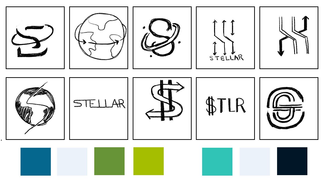
Form First, Then Color
The logo was first developed in black and white to ensure it conveyed strength, clarity, and versatility on its own. This step emphasized essential design elements such as proportion, contrast, and balance, crucial for creating a mark that feels both modern and timeless.
By stripping away color, the focus remained on achieving a clean, functional form that communicates trust and fluidity at any scale. The monochromatic approach also allowed for rigorous testing across a variety of applications, ensuring the logo maintained its impact and legibility.
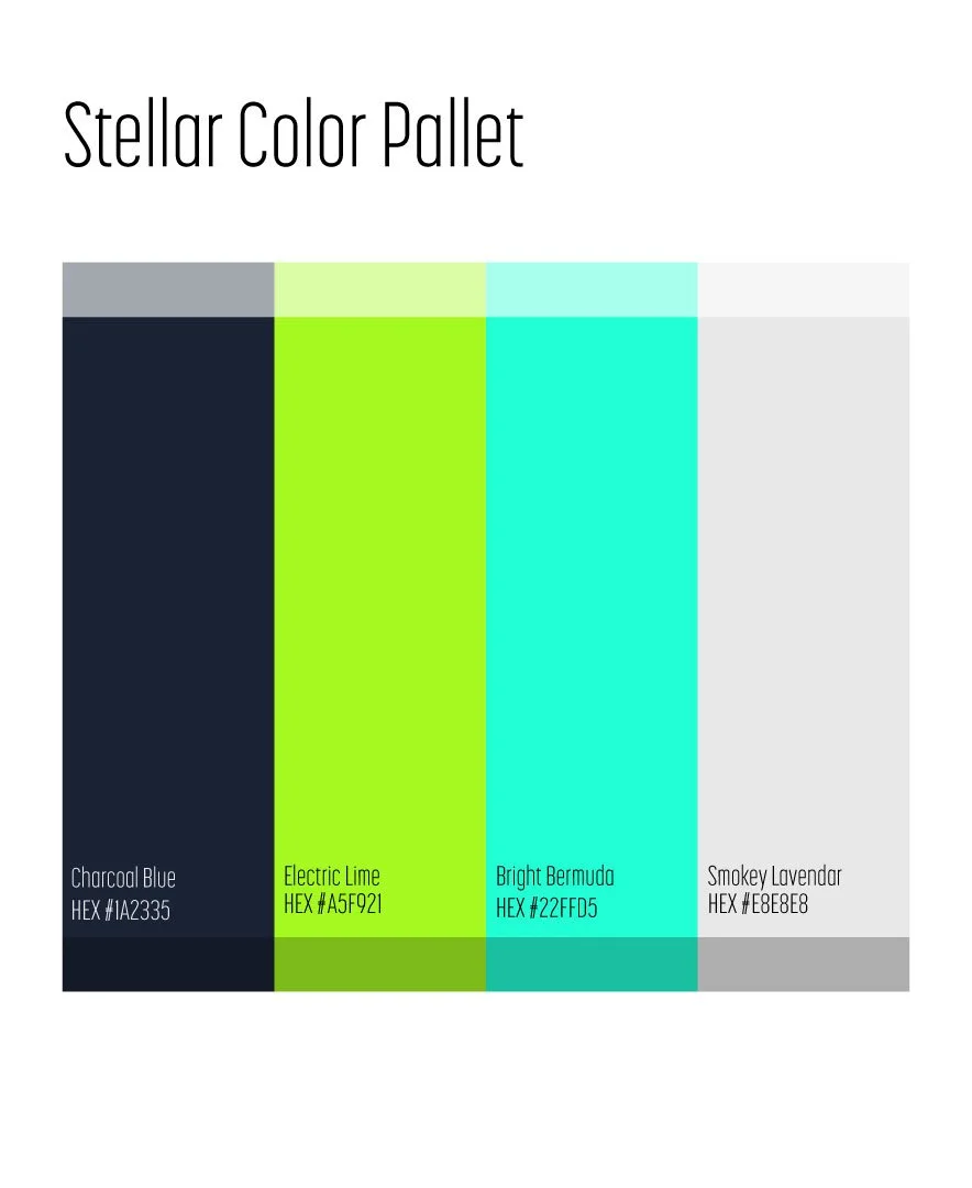
Bringing the Brand to Life
With the logo structure fully refined in black and white, the next step was selecting a color palette that would embody Stellar’s shift toward a more approachable, family-focused identity. The chosen palette strikes a balance between trust, innovation, and energy.
Charcoal Blue grounds the identity with a sense of professionalism and stability, while Electric Lime and Bright Bermuda inject vibrancy and forward momentum, reflecting the brand’s promise of speed and modernity. Smokey Lavender offers a soft, neutral contrast, adding balance and flexibility across applications.
Applied to the final logo, these colors work in harmony to create a dynamic yet trustworthy presence. The result is a versatile brand mark that feels both cutting-edge and welcoming, perfectly aligned with Stellar’s new direction.
Extending the Brand Through Movement
To bring the brand to life across digital platforms, the finalized logo design was animated to create a seamless, engaging motion piece intended for use in web and app environments. This animation builds on the logo’s sense of orbit and flow, using smooth transitions and layered movement to emphasize Stellar’s role in facilitating effortless global transactions.
The motion design enhances user experience by adding energy and professionalism to touchpoints like splash screens, app loaders, and landing pages, instantly communicating speed, security, and modernity. It reinforces the brand's identity through motion, creating a memorable, tech-forward impression that aligns with Stellar’s mission to connect people and families across borders.