Boot up
Rooted in the Player: Building a Brand for BootUp
Understanding the users was the first goal in creating BootUp, an app designed to support young soccer players on and off the field. Through detailed persona development, we got to know athletes like Jake—a driven, disciplined 17-year-old balancing academics, two teams, and aspirations for college recruitment. His needs and frustrations shaped every design decision.
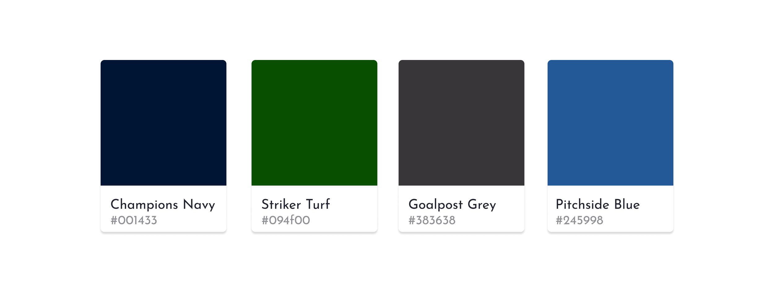
From there, the brand identity was built to reflect that same energy and focus. The name BootUp speaks to preparation, action, and momentum. The logo merges a soccer ball with an upward arrow, symbolizing not just gear, but growth. Bold navy and deep green ground the brand in strength and clarity, resonating with competitive yet grounded players. This identity ensures BootUp feels like more than an app, it feels like a reliable teammate.
Designing with Intention: Wireframing for Flow & Function
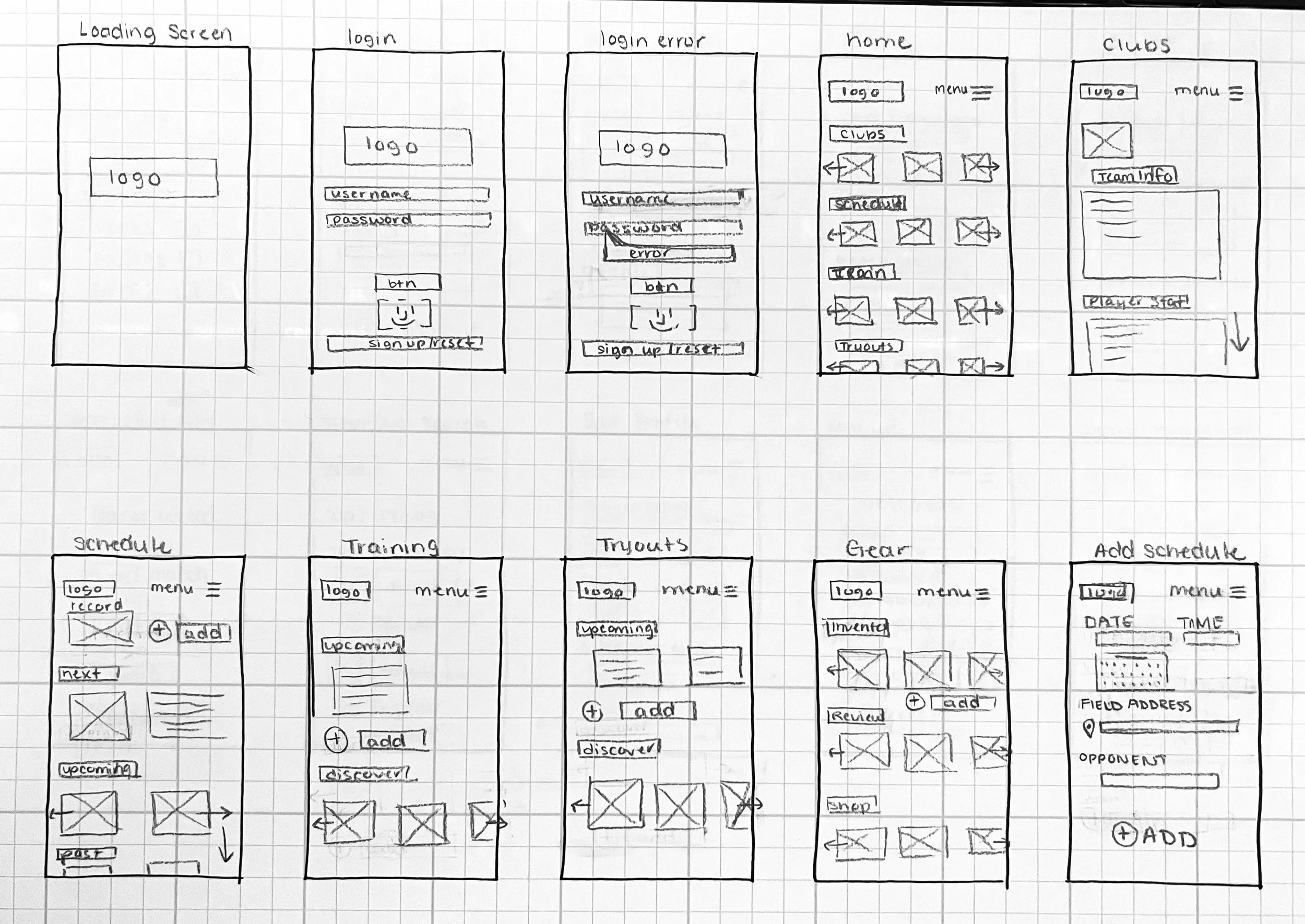
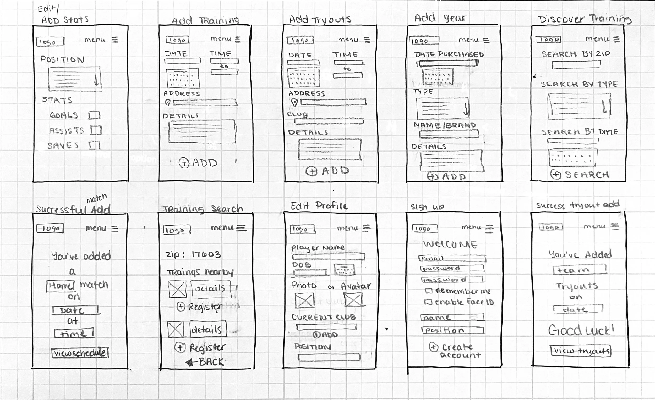
With a clear understanding of our users and brand in place, the next step was translating those insights into purposeful wireframes. For players like Jake, time is limited and mental bandwidth is stretched, so every screen needed to work with them, not against them. The wireframes were designed to streamline navigation and reduce friction, making it easy to track schedules, manage gear, and stay on top of training without added stress.
User flows were mapped around real-life routines: checking game times and locations between classes, finding new training sessions after practice, or tracking gear usage as the season progresses. By focusing on clarity, accessibility, and a mobile-first experience, the wireframes laid a solid foundation for an app that fits seamlessly into the rhythm of a busy athlete’s day—supportive, efficient, and always ready for kickoff.
Stripping It Down: Prototyping in Black & White
Once the wireframes were in place, a black-and-white prototype brought the structure to life, without the distraction of color or branding. This stage was all about function. By focusing purely on layout, hierarchy, and interaction, we ensured that every tap, swipe, and scroll supported the user’s journey.
For users like Jake, who need quick access to schedules, training tools, and gear, the prototype had to be intuitive and efficient. Clear visual pathways, simplified navigation, and prioritized content helped validate the flow and make space for real-time feedback. Testing this grayscale version with users early on allowed us to refine before committing to visual polish, keeping usability at the heart of the experience from the very beginning.
Testing the Field: Digital User Testing with Real Players
To ensure BootUp met the needs of its users, I conducted digital user testing with a focus on clarity, functionality, and relevance. Testers were given a list of realistic tasks, like syncing a practice schedule, finding a training session, or adding a gear review to see how easily they could navigate the prototype.
Beyond task completion, users were encouraged to leave open-ended feedback about what worked, what felt confusing, and what could be improved. We also included general questions to better understand each participant’s place within the target audience, whether they played soccer, used sport apps, or had children who did.
This blend of structured interaction and open insight helped us identify both friction points and moments of success. The result? A more refined, user-centered app experience grounded in real-world soccer life.
Bringing It All Together: From Insight to Impact
With valuable user feedback in hand, I moved into the final phase, refining BootUp into a high-fidelity, full-color prototype. Every update was intentional, grounded in what real users told me they needed: clearer navigation, faster access to tools, and a layout that matched the rhythm of their lives. Visual design choices—like bold contrast, athletic typography, and a clean color palette—reinforced both function and brand identity.
The result is a polished prototype that feels intuitive, energetic, and player-focused. It’s not just an app—it’s a personalized hub for young athletes like Jake, helping them stay prepared, connected, and confident as they chase their goals on and off the field.
Final Whistle: Reflecting on the Process
Designing BootUp was a deep dive into what it means to truly support young athletes through thoughtful, user-centered design. From early research and branding to wireframes, testing, and final prototypes, each step was shaped by empathy, iteration, and real user insight.
One key takeaway was recognizing how user flows can vary based on age and experience; what works for a 17-year-old competitive player might not resonate with a 12-year-old just starting out. Balancing simplicity with functionality became essential. Another important challenge was incorporating color in a way that brought energy and identity to the app while maintaining strong contrast and accessibility across all screens. Every visual choice had to work just as hard as the interface itself.
If given more time, I would prioritize another round of user testing to further refine the experience, validate changes, and ensure the final product meets the needs of an even broader spectrum of players. This project reinforced that great design isn’t just about aesthetics or usability—it’s about meeting people where they are and helping them move forward with confidence.


