ERIN BERRY
Photographer-Turned-Graphic designer
Erin Berry is a photographer-turned-graphic designer based in Lancaster, PA, with a deep passion for thoughtful creation and meaningful collaboration. With years of experience behind the camera, Erin developed a keen eye for composition, color, and visual storytelling—skills that naturally evolved into their work in graphic and interactive design. Their background in photography informs a unique design perspective that blends artistic sensitivity with strategic thinking.
Specializing in accessible, universal design and intuitive UI/UX systems, Erin approaches every project with empathy and precision. They believe great design should serve everyone, and their process is rooted in understanding user needs, clear communication, and consistent attention to detail. Whether working on branding, digital interfaces, or multi-platform design systems, Erin provides creative, intentional solutions tailored to each project’s goals.
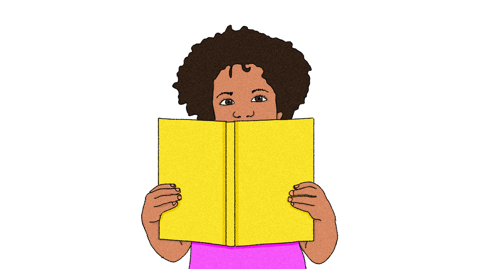
KIRA Health
Designing for KIRA means creating more than just a health platform. It’s about building a space that listens, understands, and supports people navigating complex, often overlooked experiences. For users managing symptoms, cycles, and care conversations, thoughtful design becomes a form of advocacy. From branding that feels calm and confident to messaging that speaks with clarity and compassion, every detail is crafted to empower. Through inclusive visuals, accessible language, and future-forward thinking, KIRA becomes more than a tool; it’s a partner. One that sees you, learns from you, and helps you move forward on your terms.

Boot Up
Designing an app for busy soccer players means more than just organizing gear and games—it’s about creating a tool that supports them on and off the field. For athletes juggling practices, matches, and daily life, intuitive design becomes a form of care. From branding that energizes without overwhelming to a user experience that simplifies tracking and scheduling, every choice is made with the player’s pace in mind. Through inclusive design, user testing, and attention to detail, the app becomes more than a utility—it’s a teammate. One that’s reliable, responsive, and always in your corner.

Trans Minors Rights
A website redesign is more than just a new look—it’s about creating a space that feels safe, welcoming, and easy to navigate. For the non-profit Trans Minors Rights, intuitive design isn’t just a best practice; it’s an act of care. Every element, from accessible typography to clear navigation and affirming visuals, is crafted with sensitivity and empathy. The goal? To ensure that every visitor—whether seeking resources, community, or support—feels seen, heard, and valued. A thoughtful, user-centered approach transforms the site into more than a platform; it becomes a refuge.

Hongdae Unleashed
Branding a destination is more than just a logo—it’s about crafting an experience that excites, inspires, and invites exploration. For Hongdae, a district known for its electrifying energy, every design choice—from bold typography to immersive visuals—captures the spirit of its art, music, and nightlife. Cohesive branding across logos, digital ads, print materials, and a dynamic website ensures that every touchpoint feels vibrant and engaging. The goal? To create more than just a marketing campaign, but an invitation—one that draws travelers in and immerses them in the unforgettable pulse of Hongdae.

The Fixation Files
Great design isn’t just about aesthetics—it’s about communication, clarity, and accessibility. The Fixation Files embraces the power of thoughtful print design to create an engaging, easy-to-navigate experience for all readers, including neurodivergent minds. From high-contrast typography to intuitive layouts, every design choice influences how information is absorbed and understood. Accessible print design ensures that knowledge isn’t just available—it’s truly usable. Because when design is inclusive, everyone benefits.

Elevate
Digital publications should be as intuitive as they are inspiring. Elevate blends creative, eye-catching design with user-friendly readability, ensuring that every element serves both form and function. Striking visuals, bold typography, and thoughtful layouts guide the reader effortlessly, proving that innovation and accessibility can go hand in hand. A great design doesn’t just look good—it enhances comprehension, engagement, and connection. In Elevate, storytelling and sustainability meet in a publication that is both visually compelling and effortlessly navigable.

Loops & Laughs
Great design isn’t just about aesthetics—it’s about storytelling, emotion, and experience. This explainer video masterfully blends thoughtful design with clear communication, using principles of timing and pacing to guide the viewer seamlessly from one idea to the next.
Crafted hand-drawn illustrations and a vibrant color palette work together to enhance clarity and impact, ensuring that key messages are not just seen, but felt. A strong narrative structure transforms complex information into an engaging journey—one that doesn’t just explain but captivates. The result? A seamless fusion of design and storytelling that makes learning both intuitive and visually compelling.
Clever Nest
More than just a logo, this brand identity is a fully realized visual and emotional experience. Designed from the ground up, every element works together to create a bold, memorable presence that stands out. From strategy to execution, this project delivers a cohesive brand system built to leave a lasting impression.

Health Is a Human Right
Designing a poster for a human rights campaign began with a deep dive into Article 25 of the UN Declaration, an article that speaks to the basic right to healthcare, housing, and well-being. The research uncovered staggering global disparities and framed the creative direction: the design had to inform, confront, and connect. Bold imagery and type choices reflect the urgency of the issue. At the same time, the coiled form of the snake symbolizes both danger and the medical world, making the message impossible to ignore. This project wasn’t just about aesthetics; it was about using visual language to advocate for equity and crafting a piece that could hold space in public discourse and policy critique.

Stellar Rebrand
This project reimagines Stellar with a clear purpose: to make cryptocurrency feel accessible and secure for families navigating global money transfers. With a shift in audience comes a shift in voice. This new brand identity brings warmth, clarity, and trust to the forefront of a traditionally complex space.
Spring House Brewing
This project reimagines Spring House Brewing with a bold new twist: a beer that fuses the raw emotion of early 2000s emo culture with the quirky charm of Pennsylvania Dutch heritage. By blending local tradition with nostalgic subculture, this design strikes a balance between heartfelt authenticity and playful rebellion. It brings a fresh, expressive voice to the Lancaster craft beer scene.
